A companies logo is critical to it's public image. Some brand's are so successful that their symbol, even without the company name, is instantly recognisable. Apple and Nike are two examples. Starbucks have enjoyed similar advertising success by branding their coffee cups, stores etc. with the familar green coloured logo of a two tailed siren and the text
Starbucks Coffee. Now a new logo for Starbucks brings a new business model which see's Starbucks moving into areas other than coffee.
Their takeaway cups are now branding with the new logo, the familiar two tailed siren, and the familiar green colour, but no text.
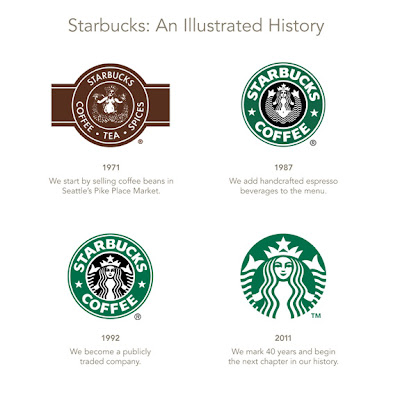
Through the their 40 year history Starbucks has evolved their logo. From the Starbucks website:
For more information on the history of the Starbucks loplease visit Starbucks' page "
Preview".
Just for a technology angle: Starbucks have free Wi-Fi in a large number of their Coffee Shops!


No comments:
Post a Comment